Wednesday, November 30, 2011

3D Printing Ultra Thin Architectural Models...Sometimes Less is More!

This week’s guest blog comes from David Munson – http://www.munson3d.com/.


Fund-raising concerns for the construction of Palm Beach Day Academy's new expansion in Florida, designed by HMFH Architects, Inc. of Cambridge, Massachusetts, lead to a large 3' square at 3/32” = 1' scale, finished architectural model to communicate their vision. We were hired to make a finish model and it was primarily 3D printed in many pieces and assembled on a wood base along with traditionally made elements like the ground and roof planes. The facades, canopies, awnings, cars, people and brick sidewalk, were all 3D printed.

All elements were very thin including the facades which had hidden structures behind them. This allowed for handling during depowdering and infiltration which prevented warping and provided a structure to glue the foam core roof to. The facades here are really being treated as a curtain wall for 3D printing.

For the paper thin canopy which has a minimal structural design, we created a temporary structure to protect during depowdering and hold it so it didn't lose shape during infiltration:

Since this model resides under a dust cover and no one will be touching, it opened up the possibility of going so thin and delicate. I've noticed that as long as the whole part is light and perhaps has a temporary structural support, we can even simulate canvas like we do here in the main canopy. The only trick is getting it through the depowdering stage because after it has been infiltrated, it’s quite strong. The awnings in this project are also ultra-light and the curved ones had special structural temporary elements which protected it until it was infiltrated.

http://www.zcorp.com/en/Solutions/Architecture/spage.aspx 

Wednesday, November 23, 2011

How to 'Create more' Efficiencies in Graphic Production Workflows for 3D Visualization Using 3D Printing

This week’s guest blog comes from David Munson, www.munson3d.com.

In the 3D visualization business we look for efficiencies in our graphic production workflows. The recycling of 3D data is a good place to find such time savers. We take the Building Information Model into 3dsMax Design, eliminating the initial step of creating the basic 3D model. In 3dsMax we texture map, light, render, animate, export to GoogleEarth, etc. and most certainly, we 3D print. When one is working on the visual model it’s best to plan for 3D printing as well and work in solids rather than surfaces. Then the fun can start! Visually rich, well crafted 3dsMax models come out 3D printed as visually rich, well crafted physical models. While we are used to thinking of THE model as in one, the ability to reproduce multiple copies at varying scales brings new opportunities. Where there are efficiencies there are opportunities! For most of our large architectural projects we also create a very small scale version which is able to be reproduced very inexpensively with ZPrinter technology. For the Monastery of the Society of Saint John the Evangelist in Harvard Square, Cambridge, we have produced thus far one large model, four medium sized and about 50 very small versions.


For Tsoi/Kobus and Associates we created one model of their UPENN Proton Accelerator project following a team members’ hunch. So we crafted a model, printed one and the client loved it and asked for nine copies with no adjustments.


Taken to the urban scale is our New World Trade Center model which has been reproduced at three different scales. The largest resides in the Fire Museum of New York and measures 17” square (each of three) and the smallest is 4” square.


 Using high resolution texture maps allows one to print large scale as well as small. Here is the Woolworth building separated out and printed a foot tall. There is much detail which just keeps coming out the more you enlarge when you start with high resolution images.


Below are photos of small and large versions of the same base 3d data with only minor geometric differences between them. This efficiency allows for our clients to get multiple small versions for a low enough cost that even if they weren't planning to make them, become interested. Our Palm Beach Day Academy client is using these models for fund raising in order to realize their expansion. We made the large model first and then the small versions.

http://www.zcorp.com/en/Solutions/Architecture/spage.aspx

Tuesday, November 15, 2011

LUMINESCENT LIMAÇON

Today’s guest blog is from Andrew Saunders; Saunders is a practicing architect and an assistant professor in the Rensselaer School of Architecture.

FLATCUT_ACADIA 2011 Design+Fabrication Competition Winner: Lighting
The Luminescent Limacon is a lighting design based on research from the Equation-based Morphologies workshop taught by Andrew Saunders. The project was chosen winner for lighting, one of three prizes in the Association for Computer Aided Design in Architecture (ACADIA) 2011 Design + Fabrication Competition. As part of the prize, the design was manufactured in the Brooklyn studio of FLATCUT_ design, and the completed lamp is on display at the annual ACADIA conference in Banff, Canada. In addition the design was also printed by Z Corporation on their ZPrinter 650 and exhibited as part of their ACADIA sponsorship.

Borrowing from the affects of the Dutch ruff as renderd by Flemish baroque painters, the Luminescent Limaçon, integrates equation-based geometry, material performance and sartorial fabrication techniques to produce unique diaphanous and volumetric lighting affects.


1. Dutch Ruff

The portraits by Flemish baroque painter Cornelis de Vos (1584-1651) and his contemporaries are renowned for their precise articulation and illumination of the flamboyant linen collars considered fashionable during this period. In relationship to performance and affect the Dutch Ruff is transformed into a vehicle for manipulating light. This occurs at two levels, both as an ephemeral reflective source and as a figural volume with a material presence. This dense accumulation of light is achieved through a combination of the chiaroscuro painting technique, which uses dramatic contrast of light to build volume, and by trapping light through a process of periodic folding that creates a deep translucent ruffle.


2. Equation-based Geometry

One of the advantages of a script-based, computational approach to design is that it enables geometric parameters to be defined with variables. The changeability of these flexible relationships allows quick, fluid, and iterative design evolution.

The global geometry of the Luminescent Limaçon is defined by the polar equation-based Limaçon curve. This roulette curve rolls at varying speeds to generate precisely choreographed self-similar profiles that are combined vertically to construct a number of volumetric formations.

At the local level, a similar roulette curve is plotted using the surface domain of the Limaçon variants. These produce profiles for folds that are nested diagonally and can be interconnected when they meet flush. Extension lengths of the folds alternate periodically to blur the profile of the global geometry and mimic the diffused lighting affects of the Dutch Ruff.


4. Sartorial Fabrication Techniques

All individually folded ruffles used to compose the Luminescent Limaçon are constructed as ruled, developable surfaces. Just as a tailor constructs and measures two-dimensional patterns on rolled fabric, pieces of the fixture can be unrolled flat and cut from planar material.

For fabrication and assembly, these surfaces are embedded with a number of parameters including placement of apertures for connection points, material thickness, tabbing and indexing. Each individual unrolled developable surface contains a unique and specific location and assembly instruction. This piece-specific DNA ensures a precise and accurate re-construction of the global equation-based Limaçon.


5. Integration

The Luminescent Limaçon is the product of an integral design process that combines computation, mathematics, material performance and fabrication. The process privileges neither of the predominant design approaches of bottom-up (internally driven) nor a top-down (deterministic). Instead, it is emblematic of an emerging design process of multiplicity, characterized by an intelligence that is motivated to generate difference through repetition in order to accommodate and respond to both intrinsic and extrinsic criteria simultaneously.


Z Corporation

As part of the exhibition, finalists in the competition were printed by Z Corp. In order to print, the developable surfaces were offset to thicken to the build tolerances. These surface overlap slightly so that the entire model is linked structurally in one build. The 3D print is one in a number of prototypes that have been developed for this project. The model will serve as three-dimensional reference for the exact geometry of the digital model and will guide future full-scale fabrications.

At this phase in the project, Saunders is pursuing multiple fabrication techniques to produce a version that involves less manual assembly (full-scale mock-ups require a lengthy and intricate assembly) in order to mass-produce the lamp at an affordable price point. One of the options being pursued is three-dimensional printing a working lamp in a variety of materials.


Design:
Andrew Saunders

Fabrication Research:
Andrew Saunders
Caressa Siu

Computational Geometry Research:
Andrew Saunders
Florian Frank

Equation-based Morphology Seminar Participants:
Florian Frank
Kate Lisi
Travis Lydon
Luca Tesio
Andrea Uras
Olesia Kruglov
Stefano Campisi
Alex Rohr

FLATCUT_Project Team:
Tomer Ben-Gal
Daniel Ramirez
Michael Licht
Francis Bitonti

http://www.zcorp.com/en/Solutions/Architecture/spage.aspx 

Wednesday, November 9, 2011

'Create more' Photorealistic 3D Printed Models; Natural Color in Architecture

This week’s blog comes from David Munson – http://www.munson3d.com/.

While the point at which an architectural project gets into photorealism is an ongoing debate for every design team, all projects do eventually. More engaged owners may request it at the onset or early in design development. At the very latest, when the building is being built, all want to see it realistically, in a reproducible medium in order to promote it. This was the case for the new Federal Courthouse in Jefferson City, Missouri with Kallmann, McKinnell and Wood as the lead designers, for which dozens of 4” diameter, 1:1000 scale 3D printed models were made.

Historically, color in 3D printing started out as a palette of primary colors for mechanical parts in engineering. When I started 3D printing in architecture five years ago, the quality was already well enough along to use for architectural finish models. Today it is simply a fantastic tool in reproducing natural color for physical model creation. At Munson3D we have produced scores of such models over the years. Below is our model of the Monastery of the Society of Saint John the Evangelist in Harvard Square, Cambridge.

Using 3dsMax Design we work with the same texture mapped model that we use for visualizations. Then we print small test pieces to nail down the final color definitions. Generally we build custom color palettes which are 3D printed to then pick what feels right. For solid colors we make coded bars which depict families of colors:

For texture mapped elements we do the same type of color bars representing textures of larger elements in the model. Each swatch has slightly different settings of hue, saturation and/or brightness:

This specific effort yielded a large, multiple pieced, 3/32” = 1' scale full color 3D printed model. Note that the glass is not monochromatic, just like in real life. One of the most common aesthetic errors made is to define glass as a solid blue color which gives an unnatural feel. Glass is reflective and therefore full of many colors and is perceived to be lighter towards the top than the bottom of a building.


http://www.zcorp.com/en/Solutions/Architecture/spage.aspx 

Wednesday, November 2, 2011

Create More Furniture Designs With 3D Printing – Lithocubus

Today’s guest blog is from Wilson Peterson of Wedge Studio; Wilson is a practicing architect and teaches at the University of Arizona School of Architecture

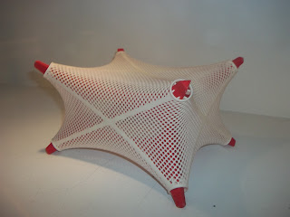
Lithocubus is a seating device that was produced for the Acadia 2011design + fabrication competition, where it placed as a finalist in the furniture category. Lithocubus takes its inspiration and its name from the Radiolarians, a variety of plankton described by Ernst Haeckel, a zoologist from the University of Jena. In the 1860s and 70s Haeckel made scientific expeditions in the Mediterranean and to the Canary Islands during which he made precise drawings of the organisms he observed under his microscope.

Radiolarians are unicellular, but are divided into a membrane containing endoplasm and outer membranes containing ectoplasm. They have skeletons made of silica, that form by accretion between the bubble-like vesicles of ectoplasm surrounding the organism. In his book, On Growth and Form, D’Arcy Thompson described the minimal surface geometry apparent in the Radiolarians.

The structure of Lithocubus follows that of radiolarians. The aluminum frame of Lithocubus is defined by the interstices between adjacent bubbles. The resulting arched forms are rigid in compression. Affixed to this skeleton is an outer fabric membrane. The organization into a compressive frame and a tensile membrane follows the logic of large-scale tensile fabric structures. The membrane is a mesh fabric with an open weave, relatively transparent, to allow the internal frame to be seen.

As a seating device, Lithocubus can be placed on any of its six sides, affording three seating heights. The aluminum frame protrudes through the fabric to elevate it off the ground. The fabric supporting the body is held by tension rings at the corners and does not contact the frame. All faces of the aluminum frame are developable approximations of the synclastically curved forms derived from the minimal surface geometry of the bubbles. The fabric surface, a complexly-curved, tensile membrane, has a more fluid geometry.

Making a 3D print of the design presented a challenge: the design proposed a transparent fabric stretched over a rigid frame. If the fabric were printed as a surface, it would completely obscure the frame. I modeled the fabric as an open weave using Rhino Paneling tools. The model was printed on a ZPrinter 650 from Z Corporation. This allowed the frame and skin to be printed in contrasting colors all at once (no assembly), so the frame is visible through the skin. This was a much clearer expression of the design intent than would be possible with a monochrome print.
http://www.zcorp.com/en/Solutions/Architecture/spage.aspx