Today’s guest blog comes from Lachmi Khemlani, Ph.D., founder and editor of AECbytes.
Towards the end of last month, I had the opportunity to attend this year's SmartGeometry conference, which was held at the Rensselaer Polytechnic Institute (RPI) in Troy, NY. The conference is typically focused on innovative architectural and structural design tools, technologies, and methods, and the theme of the conference this year was "Material Intensities." The conference is organized by the SmartGeometry Group, with Bentley Systems as the main sponsor since its GenerativeComponents software has been traditionally used by many of the leading firms that are part of the SmartGeometry Group.
This article provides an overview of the conference and compares it with the 2009 SmartGeometry conference that I last attended to see the direction in which the conference is heading, as well as analyze the relationship between academia and the industry.
http://www.zcorp.com/en/Solutions/Architecture/spage.aspx

Wednesday, April 25, 2012
Wednesday, April 4, 2012
Smartgeometry 2012 @ RPI
The Smartgeometryconference (sg2012) was held in Troy, NY, on the campus of RensselaerPolytechnic Institute from 19-24 March. Every year since 2001, the best and brightest architects, designers, and engineers gather from Practice, Research, and Academia to explore and discuss the latest trends and technology in digital design, simulation and fabrication. This year, the sg2012 theme was Material Intensities – the connections between materiality and the environment. Eleven separate workshop clusters were held during the first four days.
Several of these clusters used 3D printing to help them communicate their project size and scope. As a Silver Sponsor for sg2012, 3D Systems donated materials and printing services to support the clusters. Two projects are pictured below:

Several of these clusters used 3D printing to help them communicate their project size and scope. As a Silver Sponsor for sg2012, 3D Systems donated materials and printing services to support the clusters. Two projects are pictured below:
 |
| sg2012 Cluster: Ceramics 2.0 |

 |
| sg2012 Cluster: Form Follows Flow |
 |
| Cluster champions – David M. and Daniele G. |
During the Friday Talkshop and Saturday Symposium, 3D Systems had the opportunity to display 3D printed models and demonstrate its 3D Touch printer. In the photo above, Daniele is holding two tower massing models that were printed at the event on the 3D Touch system.
 |
3D Systems model variety Jean Sprauer, Product Manager, 3D Systems  sg2012 Cluster: Material Conflicts   Autodesk Revit Vasari designs courtesy of Zach Kron, Autodesk. Printed on 3D Systems’ ProJet™ and ZPrinter® Professional 3D Printers For more information on Smartgeometry, visit http://smartgeometry.org/ |
Wednesday, March 28, 2012
Make Yourself at Home
Today’s guest blog is from Oscar Sarlandt of Solid-Ideas


http://www.zcorp.com/en/Solutions/Architecture/spage.aspx

Our client needed a centerpiece for their sales office, a model that customers could see, touch, and connect with. Working from their 2D floor plans, we first digitally modeled the 3D townhouse, and then created a physical scale model that exceeded their expectations while staying within their limited budget. Potential buyers are now able to interact with the property and understand its layout.
Instead of having people who couldn't connect to a house shown as drawings and pictures, they now have buyers who can't wait to move in. In today's real estate market, you can't afford to be abstract.
Instead of having people who couldn't connect to a house shown as drawings and pictures, they now have buyers who can't wait to move in. In today's real estate market, you can't afford to be abstract.

Courtesy David Weekley Homes
http://www.zcorp.com/en/Solutions/Architecture/spage.aspx
Wednesday, March 21, 2012
Building Futures: Re-envisioning The Hyde at Rensselaer
Today’s guest blog is from Andrew Saunders; Saunders is a practicing architect and an assistant professor in the Rensselaer School of Architecture
Building Futures is an exhibition at The Hyde Collection running from February 11 to April 15. The exhibit presents architectural proposals designed by Rensselaer Architecture School faculty and students as an intellectual investigation stimulated by long-range planning activities for The Hyde Collection and its campus.

Faculty-led teams of students generated six proposals during a four-day charrette. Charrette is a term derived from the nineteenth-century École des Beaux-Arts in Paris for an intense creative session designed to focus multiple teams on a particular problem in compressed time and space. At the end of four days of all-day sketching, modeling and brainstorming, each team delivered a master planning strategy for expansion of The Hyde campus.


Justin Paul Ware
Shima Miabadi
Photography / Videography:
Yifeng (Jenny) Zhao
Paul Chan
Joseph Pierre Daniele
Chris Green
Will Pyatt
Tom Roland
Eric Chin
Yuan Feng
Andrew Van Meerbeke
Tiffany Chiang
Emily Broadbent
John Wallace
Erica Barrows
Octavie Berendschot
Erin Butler
Mallory Buckner
Mike Cormier
Georgeanna Foley
Sarah Goldfarb
Cady Guyton
Jessica Lapano
Gaetano Licata
Elisabeth Sabol-Low
Chloe Mahoney
Dom Petrella
Schulyer Pratt
Katie Rauth
Christina Yee
Catherine Schoen
Cat Callaghan
Tim Yiu
Jay Zhang

Building Futures is an exhibition at The Hyde Collection running from February 11 to April 15. The exhibit presents architectural proposals designed by Rensselaer Architecture School faculty and students as an intellectual investigation stimulated by long-range planning activities for The Hyde Collection and its campus.

Additional proposals on exhibit are the product of a semester-long, second-year design studio. Each student was assigned one work of art from The Hyde Collection. The work was mined for specific active techniques or “affects” that produced sensation from relationships of geometry, composition, materiality, lighting, color, nature, and the human body. “Affects” refers to philosopher Gilles Deleuze’s (1925-1995) concept of intensities transmitted by form that generate different affections in different persons. Once identified, the affects were transposed through a series of drawing and modeling exercises to amplify their spatial and material consequences and eventually motivate architectural strategies for The Hyde’s expansion.

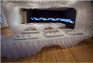
Installation
The installation is composed of 1,224 folded, developable surfaces (surfaces that can be unrolled onto a plane without distortion) digitally-generated and fabricated from sheets of translucent high-density polyethylene. It is inspired by the affects luminosity, translucency, and weightlessness transposed from The Hyde Collection’s painting of The Annunciation by the Italian Renaissance master, Sandro Botticelli (1444-1510). The Rensselaer fabrication challenges the Cartesian geometry and symmetry of the gallery space as it fluctuates between display and partition. It provides an affective environment that influences circulation as well as divides, unites and exhibits the Z-print models.


3D Systems
The Rensselaer School of Architecture and The Hyde are extremely grateful for the sponsorship from 3D Systems. Their sponsorship included Z-printing of all fourteen proposals exhibited as well as printing a scale model of the exhibition itself. In addition to delivering museum quality models and a consistency to the exhibit, the models are a display of the school’s progressive discourse, embracing and utilizing the latest technology.
The Hyde exhibit reveals possibilities for a new museum campus and is also exposing a large community of museum patrons to what the Rensselaer School of Architecture can do with the newest technologies. People are fascinated with what has been created and how it has been accomplished. It’s just one illustration of the progressive mindset of the school, museum, faculty and students.
RPI has used 3D Systems 3D printers since 1998, and its current full-spectrum color ZPrinter operates “non-stop” during a typical semester. Its speed, quality and affordability as a major advantage for students needing to create models, especially 11th-hour end-of-semester projects. As at many campuses, RPI students in other disciplines, such as mechanical engineering and fine art, have caught wind of the ZPrinter’s capabilities and are using it in their projects.


Hyde Exhibition Credits
Exhibition Design:
Andrew Saunders
Ted NgaiDesign Team
Caressa SiuJustin Paul Ware
Shima Miabadi
Joey Fala
Ryan HaoYifeng (Jenny) Zhao
Production Team:
Bill Bergman
Guillermo BernalPaul Chan
Joseph Pierre Daniele
Chris Green
Will Pyatt
Tom Roland
Assembly Team:
Ben Schneiderman
Alec DuMondEric Chin
Yuan Feng
Andrew Van Meerbeke
Tiffany Chiang
Emily Broadbent
John Wallace
Contributions:
Richard Abendroth
Alexandra Henning Erica Barrows
Octavie Berendschot
Erin Butler
Mallory Buckner
Mike Cormier
Georgeanna Foley
Sarah Goldfarb
Cady Guyton
Jessica Lapano
Gaetano Licata
Elisabeth Sabol-Low
Chloe Mahoney
Dom Petrella
Schulyer Pratt
Katie Rauth
Christina Yee
Catherine Schoen
Roslyn Dudas
Michael KehoeCat Callaghan
Tim Yiu
Jay Zhang
Wednesday, March 14, 2012
City Modelling in 3D Print
Today’s guest blog comes from George Lee of Callprint in the UK.


http://www.zcorp.com/en/Solutions/Architecture/spage.aspx
http://www.3dsystems.com
There exists, rumoured to be filling many storage shelves of a warehouse in Zagreb, a 3D printed model of that city. Why is the model in storage? Because it measures 29 meters by 18 meters, and is made up of 3,000 tiles covering 29 x 18km of the city. No permanent home has yet been found to house it, which is not surprising given its prodigious size.
In the UK, Zmapping have modelled most of the city centres in the UK, and the data are used extensively under license by architects to 3D print context models in which to present their schemes. The data are constructed from Lidar scans, photogrammetry and manual modelling in CAD. Some buildings on the model have reputedly been measured to be within 15cm of the real world buildings that they represent.


In recent years there has been a proliferation of companies creating and selling city models for a variety of purposes. For many, 3D printing is an afterthought. This is perhaps partly a reflection on lack of awareness of 3D printing and also a propensity for software developers to think solely in terms of the virtual space.
This is paralleled with the lack of real interest shown in 3D printing by the major BIM software vendors. But many exciting things are happening within the virtual database linked spaces of BIM and the city modelling developers. The Zagreb model created by Geofoto is a data base containing data derived from Lidar, with some manual input, where the roofs of each building are defined. For the purposes of 3D printing, the roofs are simply extruded into the topography and a 3D printed model is generated. There are many clever people out there creating ever more ingenious virtual spaces. However to communicate a model of a city there is nothing that beats a physical model. 3D printing is the natural link between the computer model and the physical model.
The 1:1500 Pipers model of central London created by layering up 2mm slabs of acrylic cut on a laser cutter still draws crowds of locals and tourists alike. Imagine a model of your city 3D printed in colour on a ZPrinter 650. The benefits to the city of a physical model are manifold, for planning, education, tourism and even dare I say it for social cohesion. To stand together before your city and physically see how parts make up the whole is something that just cannot be done on a computer screen. 
London city model courtesy of Pipers – view toward the Olympic Center
For more info on the Zagreb model, please visit
http://www.isprs.org/proceedings/XXXVIII/2-W11/Franic_Novakovic_Bacic-Deprato.pdfhttp://www.zcorp.com/en/Solutions/Architecture/spage.aspx
http://www.3dsystems.com
Wednesday, March 7, 2012
3D Color Printing Brings Math to Life
Today’s blog comes from George Hart of the Museum of Mathematics in NY.
At the Museum of Mathematics, which is opening later this year in New York City, we plan to show visitors that math is a fun, colorful, and creative subject. To that end, we are busy designing cool, hands-on exhibits, and I have used a 3D Systems hi-def color ZPrinter for making physical models of some exhibit ideas. But this blog post stems from another endeavor: Like many museums, we are raising money through a fundraiser dinner. I am very happy to have access to ZPrinter technology for making a series of festive mathematical centerpieces for this event.
3D printing allows the construction of intricate mathematical forms which could not be built by any other technology. The extra dimension of color allows for beautiful centerpieces that catch the eye and highlight mathematical features. Here are three of my favorites from this project:

 This centerpiece is designed with floral elements connected in ways that give an organic impression without looking like any particular flower. Through twelve pentagonal openings, you can see that the interior features sixty 5-fold flower-like forms.
 This design is purely geometric in character. A series of arches nest in a geometric series with smaller and smaller elements leading to the center. The geometric idea is based on five cubes, but they've undergone nonlinear transformations.
For more information and pictures of other centerpieces from this series, see my website.
http://www.zcorp.com/en/Solutions/Architecture/spage.aspx
http://www.3dsystems.com
At the Museum of Mathematics, which is opening later this year in New York City, we plan to show visitors that math is a fun, colorful, and creative subject. To that end, we are busy designing cool, hands-on exhibits, and I have used a 3D Systems hi-def color ZPrinter for making physical models of some exhibit ideas. But this blog post stems from another endeavor: Like many museums, we are raising money through a fundraiser dinner. I am very happy to have access to ZPrinter technology for making a series of festive mathematical centerpieces for this event.
3D printing allows the construction of intricate mathematical forms which could not be built by any other technology. The extra dimension of color allows for beautiful centerpieces that catch the eye and highlight mathematical features. Here are three of my favorites from this project:

This sculptural centerpiece has thirty yellow bumps, arranged like the vertices of an icosidodecahedron. But they connect to each other through meandering paths that weave through the interior. It is something of a maze to find a shortest path from one bump to another. Shades of color help highlight the overs and unders of the intricate paths.


For more information and pictures of other centerpieces from this series, see my website.
http://www.zcorp.com/en/Solutions/Architecture/spage.aspx
http://www.3dsystems.com
Wednesday, February 22, 2012
Arkitypo: A Study of Design and 3D Printing
Today's blog is by Jon Fidler, digital artist, who created and fabricated 26 3D letters for a collaboration project called 'Architypo' with Ravensbourne, UK-based digital media university, and Johnson Banks.
Here at Ravenbourne, a London-based digital media university, we have just completed a collaboration project with London-based design studio Johnson Banks, setting about to create an 'alphabet of alphabets' and 3D print a complete set of 3D letters, each showcasing the character and history of a particular typeface.The project came about to develop a means of testing and showcasing our in-house 3D prototyping technology. For each of the letters 'A' through 'Z,' the designers selected a typeface beginning with that character, which is used in the sculptural work. Each piece furthermore encapsulates a bit of the history of the typeface:
The 'J' adopts the form of a metro system map, because its fontface 'johnston' was originally designed for the London underground; the 'C' is composed of 'courier,' used in 1950s typewriters, and thus is composed of an assemblage of typewriter keys.
'Arkitypo' took over six months to complete. Johnson Banks first researched each letter and then developed drawings, maquettes, and simple 3D renders before transferring the imagery. Ideas came to us at Ravensbourne where we utilised our 3D expertise and further developed the 3D models, collaborating virtually with Johnson Banks before beginning the first test prints. For the creation of the letters, me and my student, Jason Taylor, used a combination of software, including Solidworks, Rhino, Autocad and 3Ds Max to obtain the required results, and in some cases the letters took days to model.
Due to the existence of over 26 letters, we required a lot of prototyping to be carried out, in order to visually analyse what the designs looked like. For this, our ZPrinter 450 stepped up to the plate and, within a couple of hours, allowed us to print scaled versions of the letters to gain a perspective on their appearance. Then, we quickly edited designs if needed and quickly printed again to check the results. We used the printer to print some of the final letters which included A,D,E,F,H,I,L,N,O,Q,R,S,V,W,X, and Z. They can be seen below alongside the description. 'O' was a great example of where our ZPrinter was great! Using other machines, the software could not handle the complexity of the object, but we were able to open it up straight away in ZPrint software and print immediately. Because ZPrinters do not use physical support structures, we saved a lot of time processing the models. We then used all of the data created for the models to create the visulisations that can be see in the video: http://www.youtube.com/watch?v=8rGUU_B78mo&list=UUovfe8uBIStUFPjdWmVAuQw&index=1&feature=plcp
The complete alphabet, as well as some of the in-process renders are shown below:
 The 'A' is composed of the typeface 'akzidenz grotesk' (1896). Among the first sans serif typefaces to be widely used, the design was part of a family of early san-serifs called 'grotesques.'
 The 'B' is composed of the typeface 'bodoni' (1798), modeled after 'baskerville,' but exaggerated in its weight, with heavier thick lines and thinner thin ones. The Johnson Banks sculpture highlights this history with a 'bodoni' 'B' that traces its origin to its 'baskerville' form.
 The 'C' is composed of the typeface 'courier' (1955), originally commissioned for 1950s IBM typewriters. Johnson Banks designed their model out of typewriter keys, referencing the old days of manual processing and jammed machinery.
 The 'D' is composed of 'DIN 1451,' the typeface selected in 1936 as the standard for German engineering and civil service projects.
 The 'E' is composed of 'engravers' (1899), designed for metal engraving.
 The 'F' is composed of the blackletter typeface 'fraktur,' modeled after antique carolingian minuscule and other handwritten designs in order to provide a standard typeface for a series of books by Holy Roman Emperor Maximilian I. 'Fraktur' became the predominant style for the following centuries, until the 20th century, where it was ultimately banned by the Nazis in 1941. Here, Johnson Banks' design alludes to the typeface's close association with bookmaking.
 The 'G' is composed of 'gill sans' (1933). Eric Gill, designer of the the typeface, is quoted as saying, 'a pair of spectacles is rather like a ‘g;’ I will make a ‘G’ rather like a pair of spectacles;' thus providing the reference point for the Johnson Banks model.
 The 'H' is composed of 'helvetica' (originally 'neue haas grotesk', 1957; renamed in 1960). Latin for 'Switzerland,' the typeface became associated with both Swiss design and modernist industry and graphic design in general. The Johnson Banks sculpture assembles together the logos of some of the many corporations that use helvetica for their brand.
 The 'I' uses 'industria,' originally designed by Neville Brody in 1984 for 'The Face' magazine.
 The 'J' is composed of 'johnston' (1916), created for the London underground transit system, referenced by the Johnson Banks model.
 The 'K' is composed of 'kabel' (1927), named in honour of the then newly-completed transatlantic telephone cable, which is the form utilized by Johnson Banks for the sculpture.
 The 'L' is composed of 'lubalin graph.' The typeface was among the first slab serif alphabets for the phototypesetting industry.
 The 'M' is based upon the 'machine' ITC typeface, often associated with industry, and thus already the influence behind the mechanical cogs used here to compose the letter.
 The 'N' is created from the 'new alphabet' typeface (1967), a minimalist experimental font based on clean lines and precise angles.
 The 'O' is composed of 'OCR-A,' whose strange characters filled the need for a font recognizable by both humans and the simple optical character recognition systems of early computers.
 The 'P' is an assemblage of letters in the typeface 'perpetua' (1929). 'Here,' the designers of Johnson Banks explain, 'It is set to perpetuate in an endless möbius strip of uppercase letters.'
 The 'Q' is composed of the typeface 'quadrate' (2002), which appears even in 2D to have a 3-dimensional element. As a result, Johnson Banks sought to produce what the real 3D letter 'could have been.'
 The 'R' utilizes 'retina' (2002), Johnson Banks explains: 'At large sizes ['retina'] seems to feature crude ‘notches’ cut into the letterforms, but these are there to compensate for the way blobs of ink blur type at tiny sizes.'
 The 'S' is composed of 'serifa' (1966), a serifed adaptation of 'univers.' In reference of this history, here the letterform appears to launch from a 'U' sculpture in 'univers.'
 The 'T' is composed of 'trajan' (1989), a contemporary adaptation of the Roman capitals engraved on Trajan's column in Rome. The historical monument itself can be climbed via an internal spiral staircase, to which the Johnson Banks 'T' sculpture makes reference.
 The 'U' is stylized in 'univers' (1957), now one of the world's most ubiquitous typefaces.
 The 'V' is composed of 'verdana' (1996), designed for screen printing and bundled with early Windows software.
 The 'W' utilizes the typeface 'wilhelm klingspor gotisch,' a blackletter design that draws from the curves of calligraphy, referenced in the Johnson Banks piece.
 The 'X' is composed of 'xheighter' (1999), a tall, condensed sans serif whose form becomes emphasized in the skyscraper-like sculpture here.
 The 'Y' features the typeface 'DFP yuan.' In addition to serving as the name for the country's currency, 'yuan' in Chinese literally means 'a round object' or 'round coin'. Here, intersecting '¥' symbols 'create an endless circle of chinese money.'
 The 'Z' is composed of the 'zig zag' art deco-style typeface, here interlocked into a zig-zagging puzzlelike form.
Project Info:
Design: Johnson Banks
Client: ravensbourne
3D imaging and prototyping: Jon Fidler and Jason Taylor
Photography: Andy Morgan
Project client: Jill Hogan
Project advisor: Ben Caspersz
Here at Ravenbourne, a London-based digital media university, we have just completed a collaboration project with London-based design studio Johnson Banks, setting about to create an 'alphabet of alphabets' and 3D print a complete set of 3D letters, each showcasing the character and history of a particular typeface.The project came about to develop a means of testing and showcasing our in-house 3D prototyping technology. For each of the letters 'A' through 'Z,' the designers selected a typeface beginning with that character, which is used in the sculptural work. Each piece furthermore encapsulates a bit of the history of the typeface:
The 'J' adopts the form of a metro system map, because its fontface 'johnston' was originally designed for the London underground; the 'C' is composed of 'courier,' used in 1950s typewriters, and thus is composed of an assemblage of typewriter keys.
'Arkitypo' took over six months to complete. Johnson Banks first researched each letter and then developed drawings, maquettes, and simple 3D renders before transferring the imagery. Ideas came to us at Ravensbourne where we utilised our 3D expertise and further developed the 3D models, collaborating virtually with Johnson Banks before beginning the first test prints. For the creation of the letters, me and my student, Jason Taylor, used a combination of software, including Solidworks, Rhino, Autocad and 3Ds Max to obtain the required results, and in some cases the letters took days to model.
Due to the existence of over 26 letters, we required a lot of prototyping to be carried out, in order to visually analyse what the designs looked like. For this, our ZPrinter 450 stepped up to the plate and, within a couple of hours, allowed us to print scaled versions of the letters to gain a perspective on their appearance. Then, we quickly edited designs if needed and quickly printed again to check the results. We used the printer to print some of the final letters which included A,D,E,F,H,I,L,N,O,Q,R,S,V,W,X, and Z. They can be seen below alongside the description. 'O' was a great example of where our ZPrinter was great! Using other machines, the software could not handle the complexity of the object, but we were able to open it up straight away in ZPrint software and print immediately. Because ZPrinters do not use physical support structures, we saved a lot of time processing the models. We then used all of the data created for the models to create the visulisations that can be see in the video: http://www.youtube.com/watch?v=8rGUU_B78mo&list=UUovfe8uBIStUFPjdWmVAuQw&index=1&feature=plcp
The complete alphabet, as well as some of the in-process renders are shown below:


Project Info:
Design: Johnson Banks
Client: ravensbourne
3D imaging and prototyping: Jon Fidler and Jason Taylor
Photography: Andy Morgan
Project client: Jill Hogan
Project advisor: Ben Caspersz
Subscribe to:
Posts (Atom)

